Today’s customers live on their smartphones, making Mobile-First Website Design more important than ever. Whether they are searching for a nearby restaurant, booking a vacation, shopping online, reading reviews, or contacting a local service provider, the first interaction with a business often happens on a mobile device.
This dramatic shift has transformed how websites should be designed. Mobile-First Website Design is no longer simply a trend—it has become the foundation of successful web development. Businesses that continue designing for desktop users first risk losing visitors, damaging their search engine rankings, and missing valuable sales opportunities.
Modern consumers expect websites to load instantly, display perfectly on any screen size, and make navigation effortless with just a thumb. If these expectations aren’t met, users rarely give a website a second chance.
In this guide, we’ll explore what mobile-first website design really means, why it matters more than ever, and how businesses can use it to improve customer experience, search engine visibility, and long-term growth.
What Is Mobile-First Website Design?
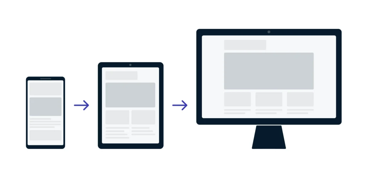
Mobile-first website design is a development strategy where designers begin by creating the website experience specifically for smartphones before expanding it for tablets, laptops, and desktop computers.
Instead of shrinking a desktop website to fit a smaller screen, designers build the simplest and most important version first.
This approach emphasizes:
- Clean layouts
- Easy navigation
- Fast loading speed
- Readable typography
- Touch-friendly buttons
- Optimized images
- Minimal distractions
Once the mobile version performs well, additional features can be added for larger screens.
Think of it like building a strong foundation before adding extra floors to a building.
Why Mobile Traffic Dominates the Internet
Over the last decade, smartphones have become the primary way people access the internet.
People use mobile devices to:
- Shop online
- Search local businesses
- Read blogs
- Watch videos
- Book appointments
- Compare products
- Make reservations
- Contact customer support
- Complete online payments
For many businesses, more than half of all website traffic comes from mobile devices.
If your website isn’t designed for mobile users first, you’re likely creating frustration for the majority of your visitors.
Google Now Prioritizes Mobile Websites
Google has fundamentally changed how it evaluates websites.
Through Google Mobile-First Indexing, Google primarily examines the mobile version of a website when determining search rankings.
This means Google considers factors like:
- Mobile usability
- Content accessibility
- Loading speed
- Navigation
- Structured data
- Responsive design
If your mobile website performs poorly, your search rankings may suffer—even if your desktop site is excellent.
This makes Mobile-First Website Design an essential component of modern SEO.
Better User Experience Leads to Better Results
A website should never force visitors to struggle.
Mobile-first design focuses on creating a smooth experience from the very beginning.
Users should be able to:
- Find information quickly
- Read text without zooming
- Tap buttons comfortably
- Complete forms easily
- Purchase products without confusion
When visitors enjoy using your website, they stay longer and interact more.
That directly improves:
- Session duration
- Page views
- Customer satisfaction
- Lead generation
- Sales
Faster Loading Speeds Improve Everything
Website speed has become one of the most important performance indicators.
Mobile users are often browsing while commuting, traveling, or using cellular networks.
Slow websites create immediate frustration.
Mobile-first design emphasizes:
- Lightweight code
- Optimized images
- Compressed files
- Efficient caching
- Reduced scripts
- Modern image formats
Even saving one second of loading time can significantly improve conversion rates.
Fast websites also help search engine rankings and reduce bounce rates.
Responsive Design Is No Longer Optional
Although mobile-first and responsive design are related, they aren’t identical.
Responsive websites automatically adapt to different screen sizes.
Mobile-first design goes one step further by prioritizing mobile users from the beginning.
The combination of both approaches creates a website that works beautifully on:
- Smartphones
- Tablets
- Laptops
- Desktop computers
- Large monitors
Users enjoy a consistent experience regardless of the device they use.
Improved Navigation Increases Engagement
Desktop navigation often contains many menus, dropdowns, and sidebars.
On mobile devices, simplicity wins.
Effective mobile navigation includes:
- Clear menus
- Sticky navigation bars
- Large clickable icons
- Simple search functionality
- Easy access to contact information
The fewer obstacles users face, the more likely they are to complete their goals.
Mobile Commerce Continues to Grow
Online shopping has shifted dramatically toward mobile devices.
Consumers now purchase:
- Clothing
- Electronics
- Groceries
- Travel packages
- Event tickets
- Digital services
- Insurance
- Food delivery
If checkout processes aren’t mobile-friendly, customers abandon their carts.
Mobile-first design simplifies:
- Product browsing
- Cart management
- Payment forms
- Checkout pages
- Confirmation screens
This results in higher conversion rates.
Local Businesses Benefit Even More
Local searches are heavily dominated by smartphones.
Examples include:
- Restaurants near me
- Dentist nearby
- Best plumber
- Hotels nearby
- Coffee shops
- Auto repair services
Most local customers want quick answers.
They need:
- Business hours
- Phone numbers
- Maps
- Directions
- Reviews
- Booking buttons
A mobile-first website makes all this information immediately accessible.
Mobile Users Have Different Behaviors
Desktop visitors often spend more time researching.
Mobile users typically want immediate solutions.
Their goals usually include:
- Calling a business
- Getting directions
- Checking prices
- Booking appointments
- Reading reviews
- Purchasing products quickly
Understanding these behaviors helps businesses prioritize the right information on mobile screens.
Mobile-First Improves Conversion Rates
A beautiful website means little if visitors never become customers.
Mobile-first design removes friction throughout the customer journey.
Examples include:
Simple Contact Forms
Ask only for necessary information.
Long forms discourage mobile users.
Click-to-Call Buttons
One tap should connect customers instantly.
Easy Checkout
Reduce unnecessary steps.
Offer multiple payment methods.
Visible Calls-to-Action
Buttons should stand out without overwhelming users.
Examples include:
- Get Started
- Book Now
- Contact Us
- Request a Quote
- Shop Today
Accessibility Benefits Everyone
Good mobile-first design also improves accessibility.
Helpful practices include:
- Larger fonts
- High color contrast
- Screen reader compatibility
- Clear labels
- Keyboard navigation
- Descriptive buttons
Accessible websites reach wider audiences while creating a better experience for every visitor.
Better Content Prioritization
Small screens force businesses to focus on what truly matters.
Instead of overwhelming users with excessive information, mobile-first design highlights:
- Main services
- Key benefits
- Contact details
- Customer testimonials
- Important offers
This clarity often improves communication across all devices.
Stronger Brand Perception
Your website often creates a customer’s first impression.
A professional mobile experience communicates:
- Trust
- Reliability
- Quality
- Modernity
- Professionalism
Poor mobile experiences create the opposite impression.
Users may assume the business itself is outdated.
Common Mobile Design Mistakes
Even attractive websites can fail mobile users.
Some common mistakes include:
Tiny Text
Users shouldn’t pinch-to-zoom just to read.
Small Buttons
Buttons should be easy to tap without mistakes.
Slow Images
Large images dramatically reduce loading speed.
Pop-ups Everywhere
Aggressive pop-ups interrupt the browsing experience.
Complicated Forms
Reduce typing whenever possible.
Use autofill features where appropriate.
Poor Contrast
Text should remain readable in all lighting conditions.
Essential Features of Mobile-First Website Design
Every successful mobile website should include:
Fast loading
Visitors expect pages to load within seconds.
Responsive layouts
Content should automatically adapt to different screens.
Optimized typography
Readable fonts improve engagement.
Touch-friendly navigation
Buttons should be appropriately sized and spaced.
Compressed images
Reduce file sizes without sacrificing quality.
Clear CTAs
Guide users toward meaningful actions.
Secure browsing
HTTPS encryption builds trust.
Mobile-friendly forms
Short, simple forms encourage completion.
SEO Advantages of Mobile-First Design
Search engines reward websites that provide excellent user experiences.
Mobile-first websites often experience:
- Better search rankings
- Lower bounce rates
- Longer visit durations
- Improved Core Web Vitals
- Increased organic traffic
- Higher click-through rates
SEO today extends far beyond keywords.
User experience has become equally important.
Mobile-First and Core Web Vitals
Google evaluates websites using Core Web Vitals.
These include:
Largest Contentful Paint (LCP)
Measures loading performance.
Interaction to Next Paint (INP)
Measures responsiveness after user interaction.
Cumulative Layout Shift (CLS)
Measures visual stability.
Mobile-first optimization helps improve all three metrics.
Better scores generally contribute to stronger SEO performance and happier users.
Industries That Benefit Most
Virtually every industry gains from mobile-first design, but some benefit even more.
Examples include:
- Healthcare
- Hotels
- Restaurants
- Real estate
- Travel agencies
- Educational institutions
- Law firms
- Construction companies
- Online stores
- Financial services
- Automotive businesses
- Fitness centers
Whenever customers search on the go, mobile optimization becomes critical.
Preparing for the Future
Technology continues evolving.
Consumers increasingly browse using:
- Foldable phones
- Smart watches
- Voice assistants
- Tablets
- Smart TVs
- Connected devices
A mobile-first mindset prepares businesses for future innovations by emphasizing flexibility, performance, and usability.
Rather than redesigning from scratch whenever a new device appears, businesses with a solid mobile-first foundation can adapt more easily to changing technologies and user expectations.
Best Practices for Implementing Mobile-First Website Design
Whether you’re launching a new website or redesigning an existing one, keep these practical recommendations in mind:
- Design for the smallest screen first. Start with essential content and functionality, then progressively enhance the experience for larger devices.
- Prioritize speed. Compress images, minimize unnecessary scripts, and use efficient coding practices.
- Keep navigation simple. Users should find important pages within a few taps.
- Use readable typography. Choose font sizes and spacing that are comfortable on smaller screens.
- Make touch interactions easy. Buttons and links should be large enough to tap accurately.
- Test across multiple devices. Don’t rely on a single smartphone model. Check performance on Android, iPhone, tablets, and desktop browsers.
- Optimize forms. Reduce the number of fields and enable autofill whenever possible.
- Monitor performance regularly. Use analytics and performance tools to identify opportunities for improvement.
Following these best practices helps ensure your website continues delivering an excellent experience as user expectations evolve.
The Business Impact of Mobile-First Design
Investing in a mobile-first website isn’t just about aesthetics—it delivers measurable business benefits. Companies that prioritize mobile usability often see improvements in customer engagement, search visibility, and revenue.
Some of the long-term advantages include:
- Higher customer retention
- Increased online inquiries
- Better lead quality
- More completed purchases
- Improved brand credibility
- Stronger local search performance
- Lower website abandonment rates
- Better return on digital marketing investments
As digital competition grows, businesses with fast, intuitive, and mobile-friendly websites gain a significant competitive advantage over those relying on outdated designs.
Conclusion
The internet is now a mobile-first world, and customer expectations continue to rise. A website that performs well on a desktop but struggles on a smartphone is no longer enough to compete effectively.
By embracing Mobile-First Website Design, businesses create faster, more accessible, and user-friendly experiences that satisfy both visitors and search engines. From improved SEO and stronger Core Web Vitals to higher conversion rates and increased customer trust, the benefits extend across every aspect of an online presence.
Whether you’re a small local business, an eCommerce store, or a growing enterprise, designing with mobile users in mind is one of the smartest long-term investments you can make. In an era where first impressions are often formed on a phone screen, a mobile-first approach ensures your website is ready to engage visitors, build credibility, and drive sustainable business growth.